For the last 10 days, I’ve been obsessed.
The Guardian put together a brilliant dashboard overviewing the FIFA World Cup – all 1,248 players from 48 nations – with pictures, interactivity and information on each participant. It is so much fun to play with, and so much fun to lose yourself within. It felt like an old-school Internet rabbit hole. Just clicking on link after link, as I learnt about everyone from Algeria’s goalkeeper to Uruguay’s strikers.
And a simple question kept swirling around my head: why couldn’t we have something similar for cricket? Something between a months-long reporting project on each player, and a half-hour, half-arsed preview of a game? A proper dashboard that you could come back to when you had five minutes to kill, and one that you could also waste hours on.
The more I thought about, the more I realised I had to at least try to build it. Luckily for me, there happened to be a cricket World Cup this month, so I had an easy topic to focus on. 180 players, 12 teams, and a fairly unpredictable tournament with at least five potential contenders, multiple underdog teams with genuine stars, wonder kids ready for their breakout game, and countless narratives waiting to be uncovered.
It felt like all that was needed was some fun, easy context. So, I built the definitive Women’s T20 World Cup dashboard. If that link isn’t working, you can visit womenst20wc.vercel.app. There will also be a link in the header on Best of Cricket’s homepage.
The idea is simple; the team overview should give you a glimpse into how the team may perform. Their form, their unique characteristics, an overview of their team, a look at the player their hopes are pinned on, & a look at all the players in their squad.
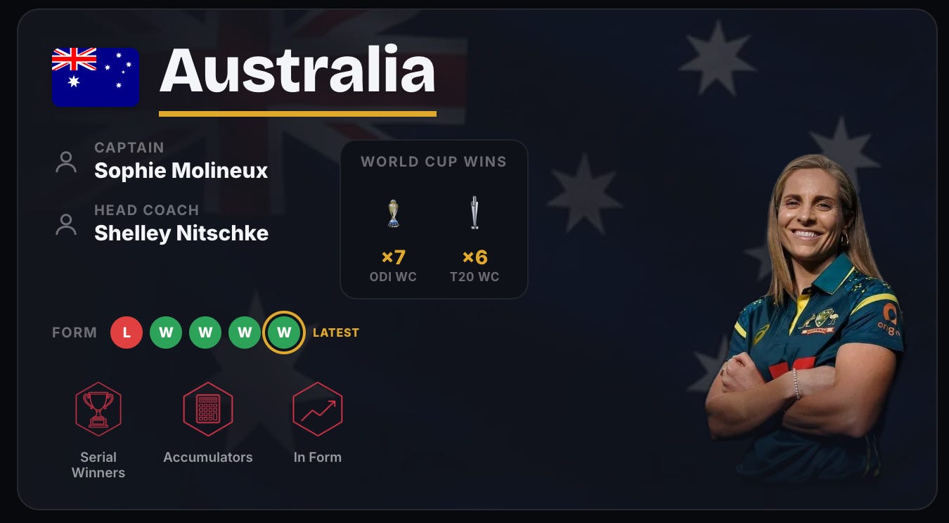
There are a few functional aspects here; their form, their World Cup history, their captain and coach. But, there’s one bit that I’m most proud of – the badges. There are nine team badges signifying everything from form to strengths, and even whether a team has the best range of players at their peak.
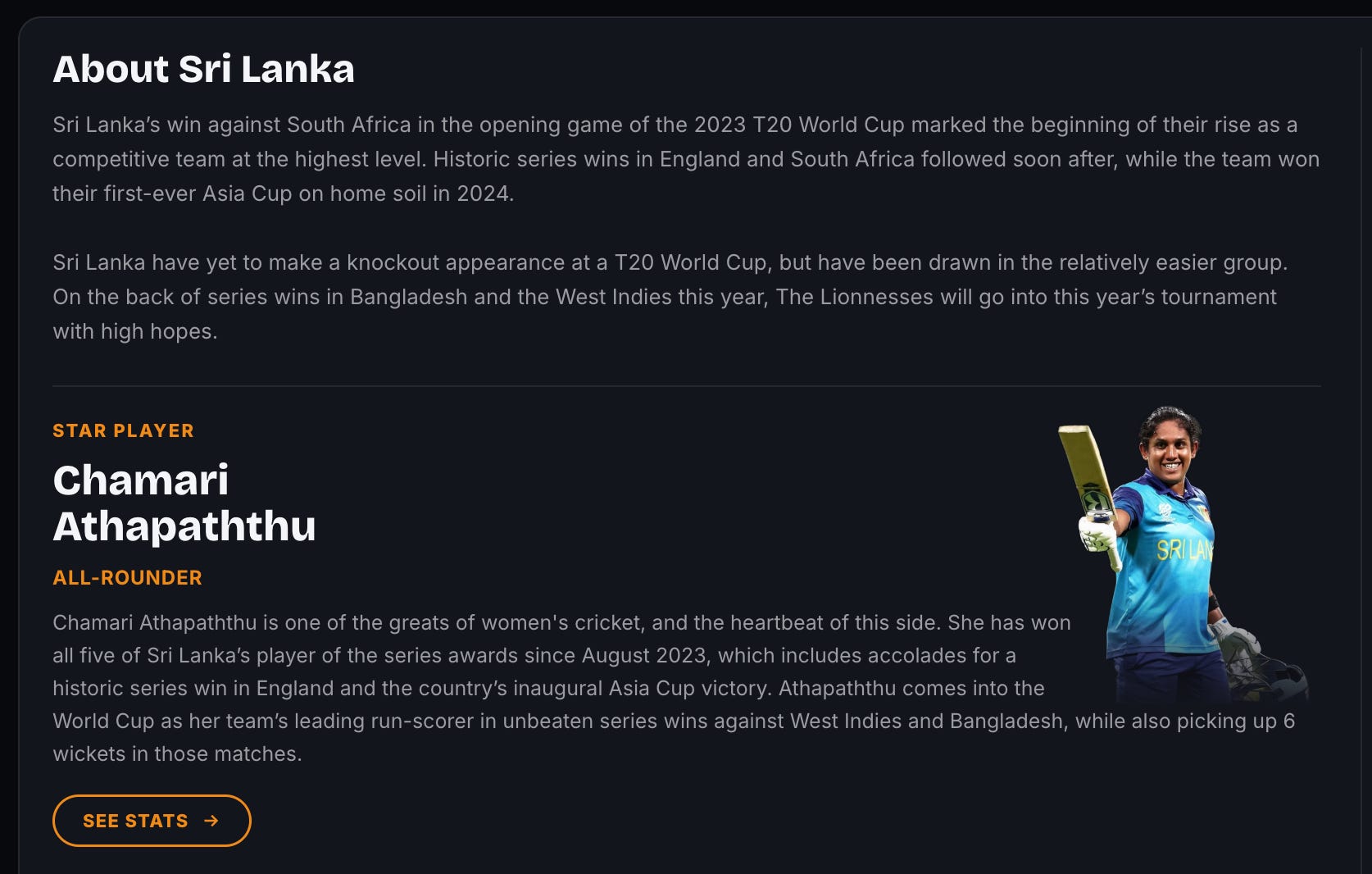
Up next are team bios and profiles of the players that are the most important to each team’s hopes for success. This is where I have to credit a few other folks for their amazing work. Without Karan, Tanvi Bhasker & Sarthak Dev, this dashboard would not have been possible! They wrote these profiles for every team and player.
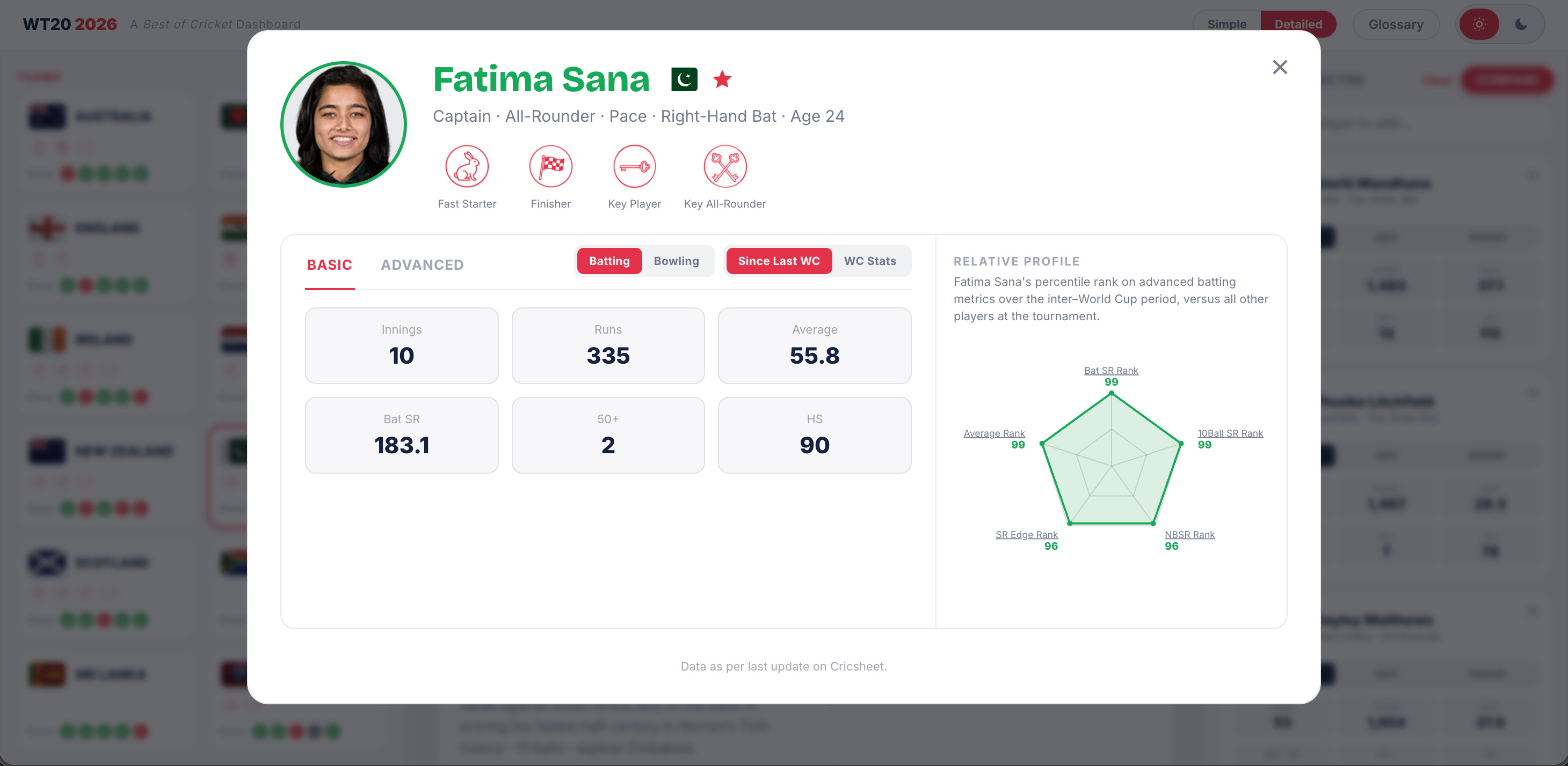
And so we get to the meat and potatoes. All 180 players (and counting as players get replaced due to injury) from all 12 teams, each with their own in-depth statistical profile and player badges where applicable.
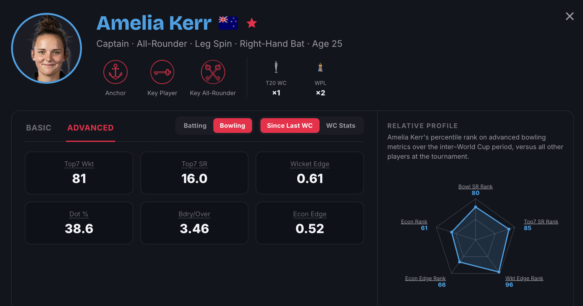
The player profiles are a lot of fun. Stats are relative to their profiles; bowlers only get bowling stats, batters only get batting stats, and all-rounders get the lot. There’s a whole bunch of filters here; batting v bowling, basic v advanced, stats since the last World Cup and stats during the World Cup. And, of course, 12 player badges that cover the players’ strengths and weaknesses with fun graphics.
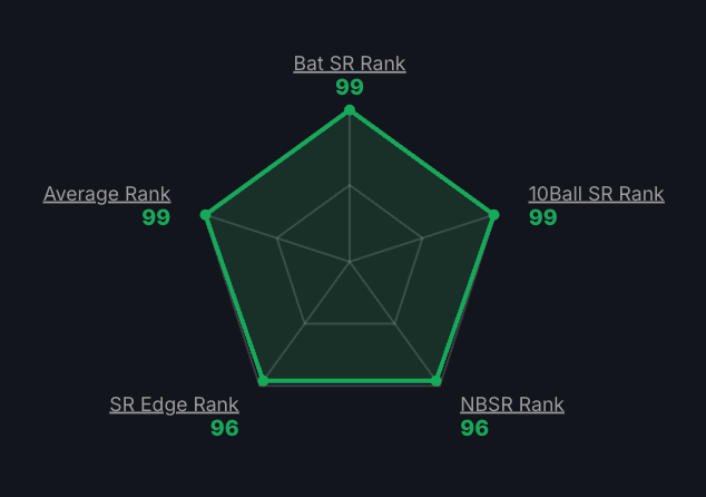
The advanced stats, and the radar graph that accompanies it, are my favourite parts of the player profile. The radar graphs are a lot of fun because they output a percentile rank that compares specific skills amongst all World Cup players. It’s really useful to determine just how good a player is relative to the field.
The batting stats include variants on strike rates that are important for T20s – first 10 balls, powerplay – and the various types of scoring such as non-boundary strike rates, dot percentages, and more.
The bowling stats include variants on economy – dot percentages and boundary run concession – and wicket taking, including a focus on matchups versus Top 7 batters specifically.
And then, we have three new metrics that I’ve developed; Strike Rate Edge, Economy Edge, & Wicket Edge. In short, they help determine how often a player outperforms their teammates on batting strike rate, bowling economy, and bowling strike rate.
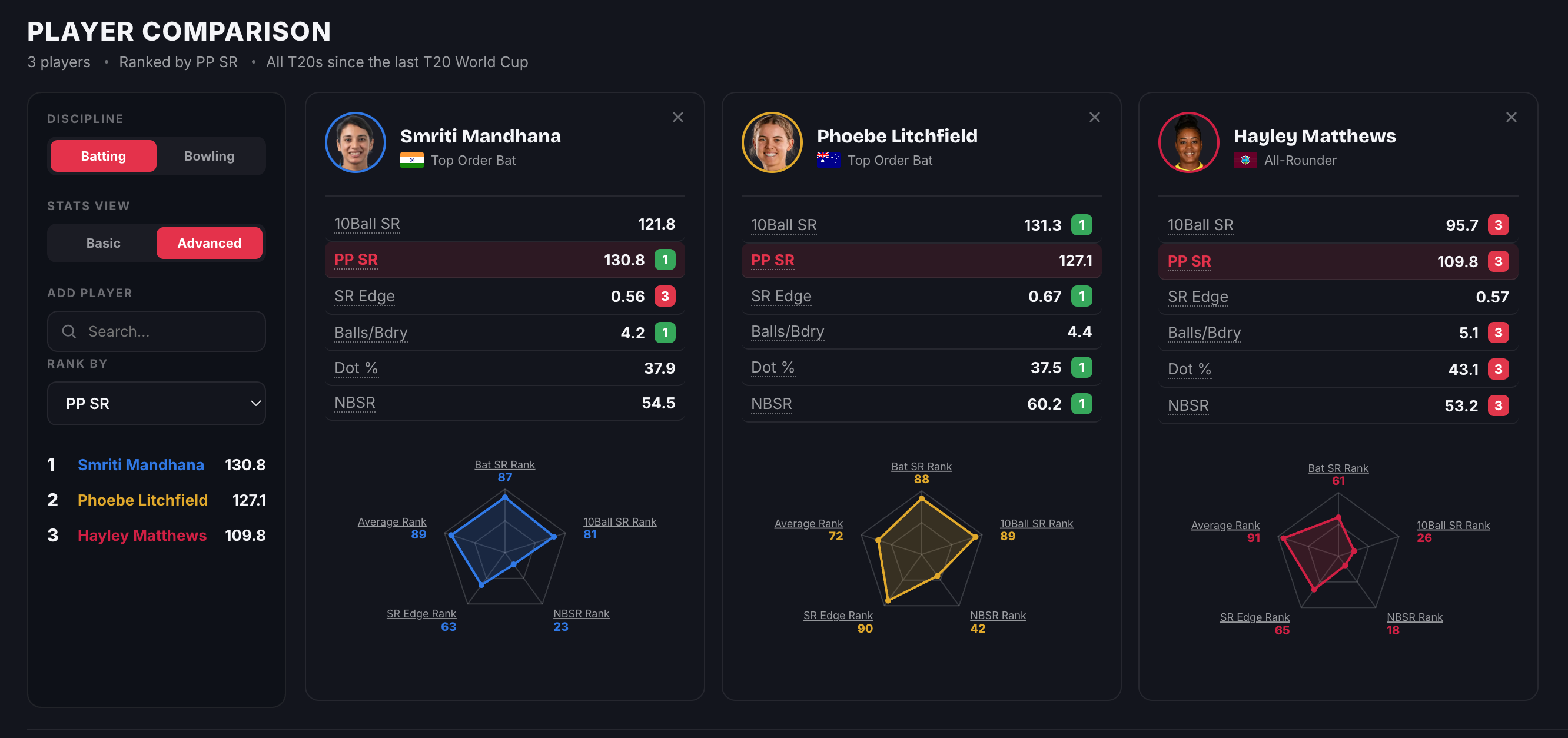
This is the bit that took me an extra couple of days to get together; I wanted to compare the stats side-by-side. To look at players in the same team to determine batting orders, to compare how players in similar positions play, to see how players perform on the basic versus advanced stats (there are a lot of differences).
Also – look at the pretty colours! Each player’s name on the left-hand side ranking and their individual graphs links to a colour that represents their team! I’m so happy with that.
I built this for a very specific reason; a more fun use of my five-minute breaks everyday than just endlessly scrolling Twitter for the umpteenth time. I’ve spent 10 days diving deep into these numbers, but even I learn something new every time I play with the dashboard.
But, it’s also quite useful to understand the games. I covered the India-Netherlands game earlier this week, and the dashboard helped save time on multiple data points; the surprising run-scoring between Smriti Mandhana & Shafali Verma (they ran between the wickets way more than usual), as well as Netherlands’ heavy batting dependence on Heather Siegers (her SR is in the 140s, while her teammates are stuck in 100s).
Beyond all that, I hope it’s a fun new way to engage with the Women’s World Cup. To learn about Bangladesh’s impressive young core, to appreciate the brilliance of South Africa’s Laura Wolvaardt, & to understand the versatility of Australia’s Beth Mooney.
And, if the colours aren’t to your liking, don’t worry. There’s a light mode too.