With just two weeks to go until the first pedal strokes of the 2026 WorldTour season in Australia, we now have a flood of new kits to get familiar with.
Today, we’ll be placing a critical eye on the waft of new WorldTour jerseys, casting our judgment from Lidl-Trek to EF Education-EasyPost. We’ll roll through the men’s and women’s teams, scoring each kit on a scale of one to ten. Remember, these scores are entirely subjective, so feel free to get your pitchforks at the ready.
22. Ineos Grenadiers
We begin with the stinker of all stinkers – the team that made us wince more than any other this off-season.
At first glance, Ineos Grenadiers’ jersey doesn’t look too offensive. They’ve opted for a fiery orange, while the TotalEnergies logo gets a more sensible cameo on the lighter bottom half of the jersey.
The real visual atrocity here, however, is the shorts, and oh my are they egregious. These wispy grey bibs are less Jayco-AlUla and more fashion police. In such a light tone, it looks as though the riders got changed in the dark given how poorly it matches with the rest of the outfit. Not just that, a rainy day is all that separates us from getting a glimpse of Kévin Vauquelin’s undercarriage. That’s not what we need in Paris-Nice now, is it?
While the pros will be forced to ride this Pompeii ash tone, orange and black alternatives are available on the Gobik website. Either would have been a better alternative.
Note: Oh me, oh my
Score: 3/10
21. UAE Team Emirates XRG
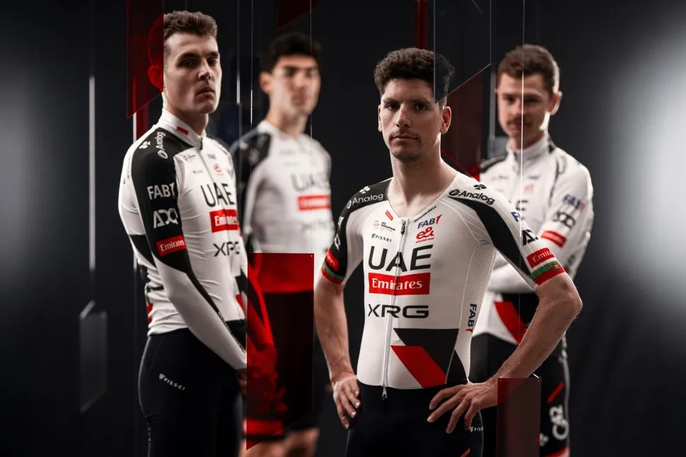
Pissei continue to supply juggernauts UAE Team Emirates XRG with their kit despite their relatively small reputation on the cycling market. What they bring to the table this year, however, is an outfit that resembles a bleeding orca whale.
In fairness it merges the typical UAE colours, although with more red than before. I’ll admit, this contrasts nicely with the scarlet of the Emirates logo, but it doesn’t save this jersey from its low-table fate on our list.
To that end, I can’t ignore just how dated this whole outfit looks. It’s unnecessarily maximalist, exaggerated by a strange asymmetric sleeve design that looks even worse when paired up with full-length arm warmers. More significantly, the block effect on the bottom part of the jersey seems unnecessary and plain old dated. It’s almost like stylised quotation marks or something that should be on the cover of a 1970s textbook.
Note: It’s 2026, not 2006
Score: 4/10

20. Lidl-Trek

I hate to bring the mood down, but I have never liked a Lidl-Trek jersey. The colours are too garish, the blocky logos look out of place, and the designs appear far too amateurish for a team backed by one of Europe’s biggest supermarkets. Perhaps I’m just missing the old Trek-Segafredo jerseys – they were always a class above.
Nevertheless, the latest iteration sees the jersey increase its share of blue. The front panel throws in a geometric pattern while the adjoining sleeves remain red and yellow. These changes leave me just as unenthusiastic as before. This is the cycling jersey equivalent of a set of children’s plastic cutlery.
Note: Lego Duplo
Score: 4/10
19. Alpecin-Premier Tech

After the Canadian tuxedo of 2024 and the funeral garms of 2025, Alpecin-Premier Tech have stepped through cycling’s Narnia wardrobe to 2023. I don’t blame them either as this team won a pair of Monuments and a green jersey that year.
If you need your memory jogged, this jersey looks nearly identical to that of 2023. The only difference is the slightly more detailed gradient near the waist. Apart from that — and the addition of Premier Tech logos — it’s uncanny.
Lack of creativity aside, this is a relatively uninspired jersey design. It does nothing to set itself apart, and there’s nothing groundbreaking either. Consider it the Coldplay of pro jerseys.
Note: Offensively uninspired
Score: 4/10
18. Uno X Mobility
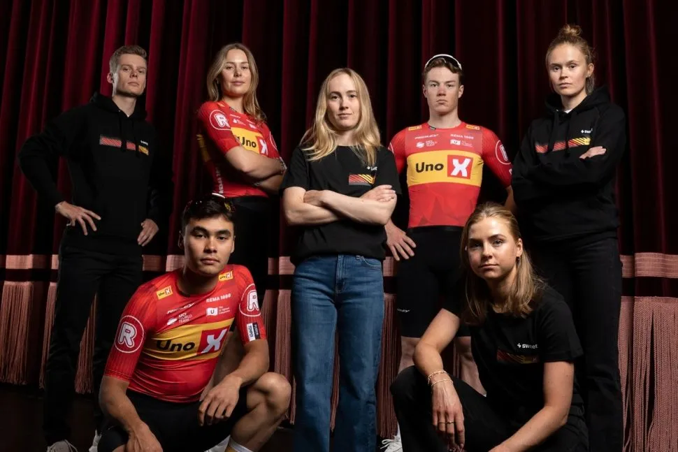
Someone wake me up when Uno X release a new kit design.
Yes, I’m growing a little bored with this ketchup and mustard combo. It’s distinctive, but that doesn’t mean it’s interesting. In fact, this is a carbon copy of last year’s. At least they won’t have to alter the yellow accents once the Tour de France comes around.
Note: Nothing much to say
Score: 4/10
17. Groupama-FDJ United

If there’s one thing you can be certain of, it’s that Groupama-FDJ United will unveil a blue, white and red jersey. They’re French after all.
For 2026, they’ve swapped kit providers for Belgian brand Bioracer, who now supply their threads.
I guess the brief was to copy the squad’s Tour de France jersey. While it’s nearly identical, this doesn’t have the same bite. The red sleeve now bleeds into the shoulder panel, the playful icons featured on the Tour kit have been culled for some gradiented stripes, and the fade to navy near the waist looks much harsher. To add insult to injury, the helmet and gloves look very out of place in lighter tones than the rest of the jersey.
It’s hardly reinventing the wheel, but it’s pleasant enough to be mid-table in our ranking.
Note: Not very va, va, voom
Score: 4/10
16. UAE Team ADQ
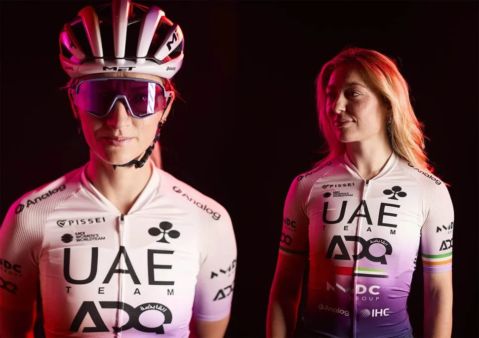
UAE Team ADQ shook up their jersey in 2025 after dragging their horrifying bath bomb-inspired kit for far too long. After a successful year in their cleaner look, the Emirati squad have only made some minor changes ahead of 2026.
Most notably, the coloured accents have been darkened slightly. The shade of purple is now much deeper and more widespread, while the former orange turns to a more golden hue. It still looks very soulless and corporate — let alone irrelevant to the colours of the UAE flag — but it’s perfectly functional and distinctive for now.
This jersey might be middle of the road, but we’ll probably become accustomed to it on the podium of major races in 2026. This team have spent more on transfers than they have on graphic designers.
Note: ‘ChatGPT, create a women’s cycling jersey’
Score: 5/10
15. XDS-Astana
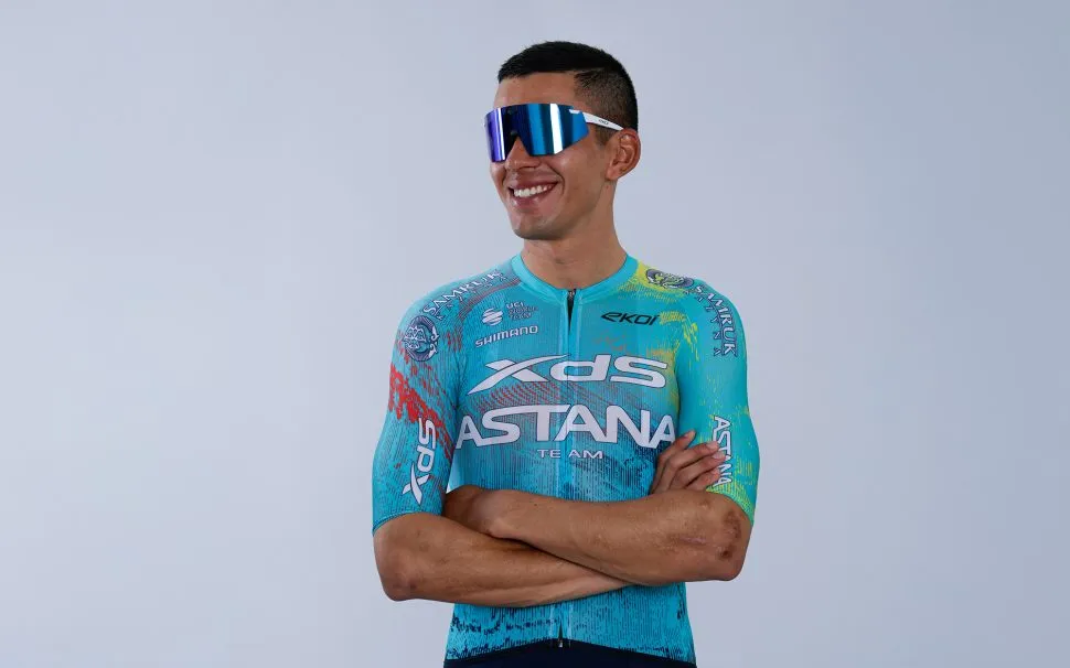
XDS-Astana have mostly recycled their kit from the 2025 season. If you’re playing spot the difference, the XDS and Astana logos have been expanded on the chest, and the splodges of colour have been shuffled around ever so slightly.
Although I described this kit as a children’s entertainer’s costume last year, I have warmed up to this number. The iconic Astana baby blue needed a bit of a refresh, and the primary colours dashed throughout this jersey might just be the secret behind XDS’s landmark 2025 season. Here’s to hoping for the same fortune in 2026 – they’ve even posted a good luck rap to send them on their way.
Note: Same old, same old
Score: 5/10
14. Visma-Lease a Bike

Another year, another bang average Visma-Lease a Bike kit.
It’s a shame because the team’s final 2025 jersey, a collaboration with clothing newbies Nimbl, was rather nice. Since then however, we’ve managed to time-travel back to the early 2020s in a kit that utilises a half-and-half effect – or some kind of crayoned gradient.
The team enjoyed at least four different variants of their jersey last year, so expect some switch-ups throughout the year. That’s something to look forward to, I guess.
Note: Thank God there are no bee references
Score: 5/10
13. Lotto-Intermarché
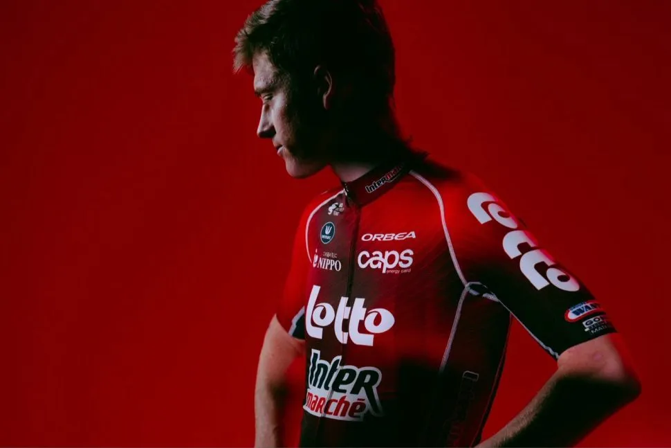
In reality, the Lotto-Intermarché merger seems more like a Lotto squad with a small Intermarché appendage. Several big names left as collateral damage, chiefly Biniam Girmay, and this deflated super-team seems to have pissed more people off than it has pleased.
When looking at the jersey, the one-sided nature of this merger manifests once again. Gone is the fluo yellow of Intermarché-Wanty (thank God). Instead it’s washed out by the classic red of Lotto, the team’s core colour over the past two decades. While the design certainly has a Lotto bias, the Intermarché logo looks at home on the body of this one, while the bibs stay black and free from any funny business.
As a whole, it’s a safe jersey stylistically. It builds upon last year’s crimson effort, with some slight darkening in tone to keep it different. I can’t knock it, to be honest. It’s nice enough.
Note: There’s no harm in playing it safe
Score: 6/10
12. Bahrain Victorious
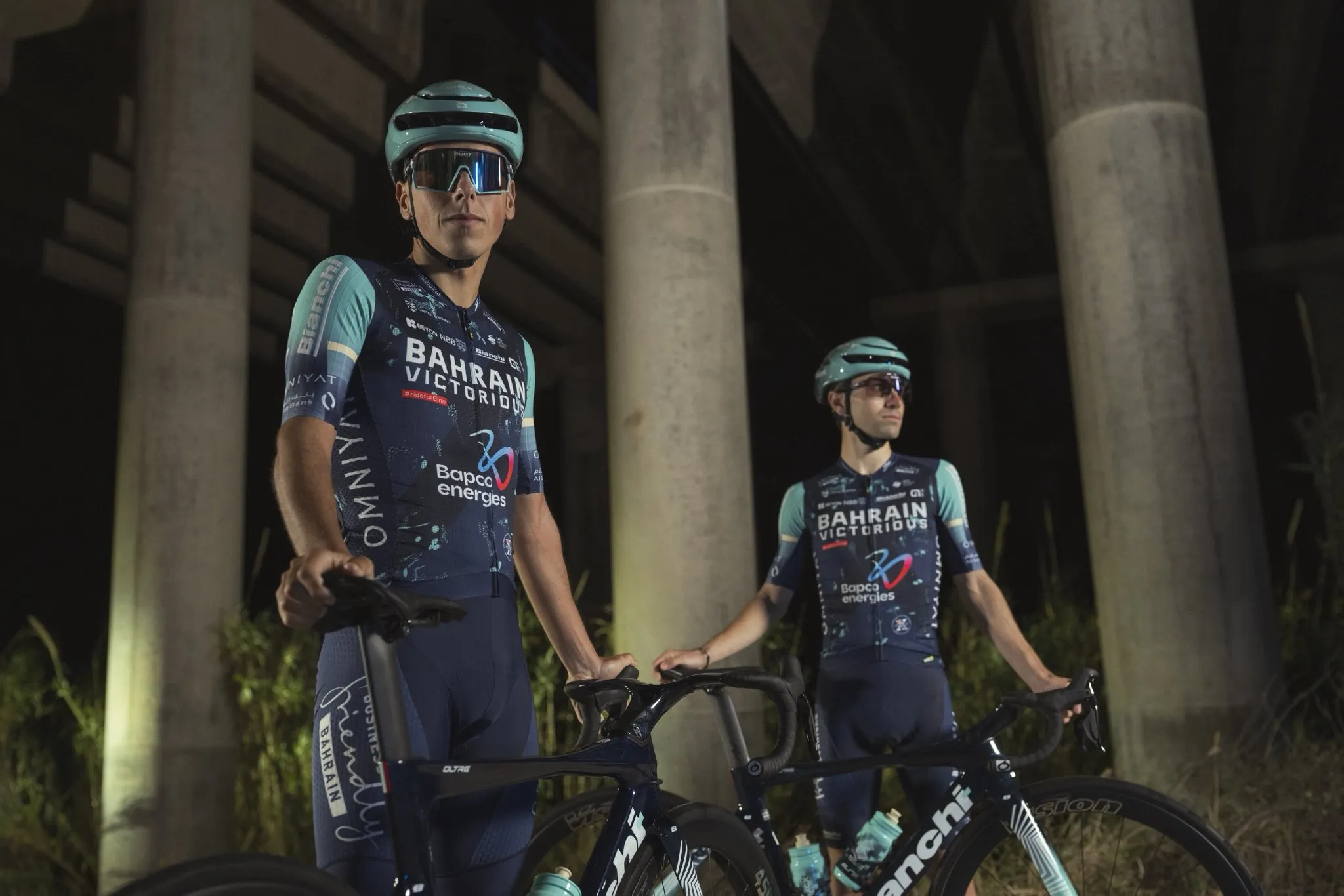
After several years sporting a predominantly white look, Bahrain Victorious have swapped the lighter hues for a deep navy. I’m not sure why, since blue does not feature on the Bahrain flag.
Now, the team already had light blue accents on their jersey and equipment. After having teamed up with Bianchi though, the celeste now has an increased role on the jersey, occupying both sleeves. This pairs well with the blue helmets and eyewear, of course, with the bike stealing the show underneath.
More than anything, I’m glad to see the team park the white theme to one side. It was incredibly boring and hard to spot within the bunch. That said, at least there’s some white on the Bahrain flag.
Note: Thankfully there’s less blue in the peloton these days
Score: 6/10
11. Soudal-QuickStep and AG Insurance-Soudal

After a year of coloured differentiation, both the men’s and women’s Soudal squads have harmonised their jerseys.
Now freed of Remco Evenepoel from their payroll, the teams haven’t DIY tie-died their jersey like last year. Instead, they’ve injected some intergalactic touches and unveiled a lime green-hued number for 2026. It’s a little too late to call this Brat green, but it should stand out. Seriously, there’s barely any green on the WorldTour in 2026.
Besides, this jersey is a slight change of pace for QuickStep, who have often lent on familiarity in its jersey designs. The helmets, however, look slightly off as they’re a conflicting shade of blue. I’m willing to forgive them.
Note: Slime inspired?
Score: 6/10
10. Movistar
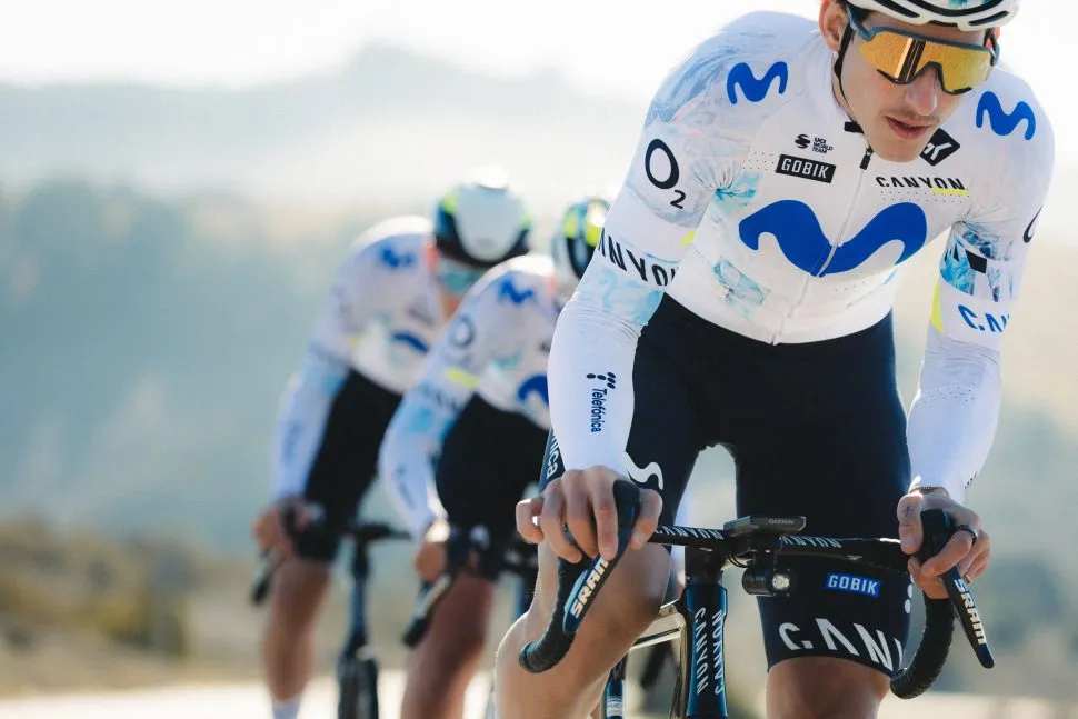
Movistar have gradually ditched their former blue designs in favour of something more white. Hopefully, that’s not a sign of capitulation this year though.
In their whitest kit to date, the Spanish squad have dropped the glitchy blocks and swapped them out for an iridescent puddle effect — almost as if a gutter had been infiltrated by a spilt bottle of de-icer. Alongside this effect, there’s more of an emphasis on the fluo accents than last year, which come in handy given the lack of fluorescent yellow in the peloton this year after Intermarché’s merger.
On the whole, this kit is perfectly inoffensive. That doesn’t mean it’s unattractive — it’s a good kind of boring. Think of this as your plain white rice of the pro cycling wardrobe.
Note: A visual Ryvita cracker
Score: 6/10
9. Red Bull-Bora-Hansgrohe

Now into their third season with Ralph Denk’s project, Red Bull-Bora-Hansgrohe have drastically shaken up their look for 2026. Or have they? This looks like the marriage between the team’s Tour de France jersey from last year and the original Red Bull kits from previous seasons.
Indeed, white now plays a bigger role than Red Bull’s proprietary navy. In fairness, there are some blue sleeves, although they appear more royal blue in tone than what we’ve become accustomed to on both the bike and F1 cars. At least these sleeves seem to match the brand’s checkerboard print helmet decals on the other hand.
The stripes on the jersey are also a decent addition, but they’re not that distinctive when a rider’s perched on the saddle. You best believe they won’t be noticeable when I’m tuning in from a dodgy livestream either.
Note: At home on a gondola
Score: 6/10
8. Human Powered Health
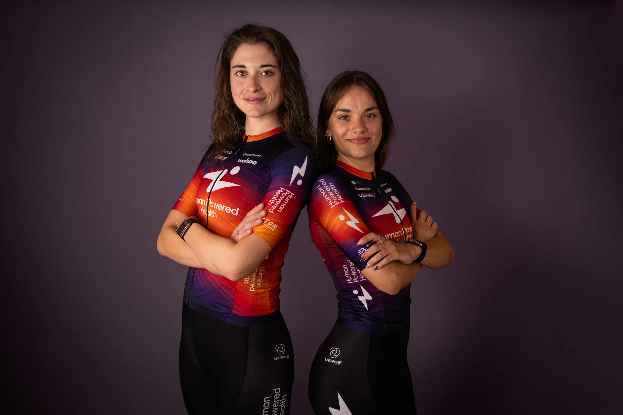
While pinks and purples have been cut down in the women’s peloton in 2026, Human Powered Health have retained their bright shades despite changing clothing provider from Pactimo to Verge.
That said, the American squad’s jersey has been toned down ever so slightly as purple takes more precedence. This helps to position some of the sponsor logos better, but it’s ultimately less playful than their previous threads. Perhaps Ineos have stolen the orange-tinged limelight this year in that regard.
Nevertheless, it’s a good thing they ride in such bright colours, otherwise we’d completely forget about them. Seriously, I’m surprised they survived the relegation cycle.
Note: I can’t believe they’re still WorldTour
Score: 7/10
7. FDJ United-Suez

FDJ United-Suez’s two previous jerseys were all-timers, near the top of the class in the women’s WorldTour. For 2026 though, the team bets on precedent and reprises its special kit from the 2025 Tour de France Femmes as a season-long outfit.
It’s predominantly black, with just a couple bursts of real colour around the chest. Those smears of blue and red hark to the national colours, but it’s nowhere near as French-looking as the squad’s previous efforts.
Alongside a couple of new sponsor logos, there’s a strip of red and blue on the rear side of the jersey that does add some character to a rather dark kit, but it’s likely to be covered by race numbers once we spot the likes of Juliette Berthet and Évita Muzic in action.
Note: It’s a nice kit, it’s just not as good as last year’s
Score: 7/10
6. Jayco-AlUla and Liv-AlUla-Jayco
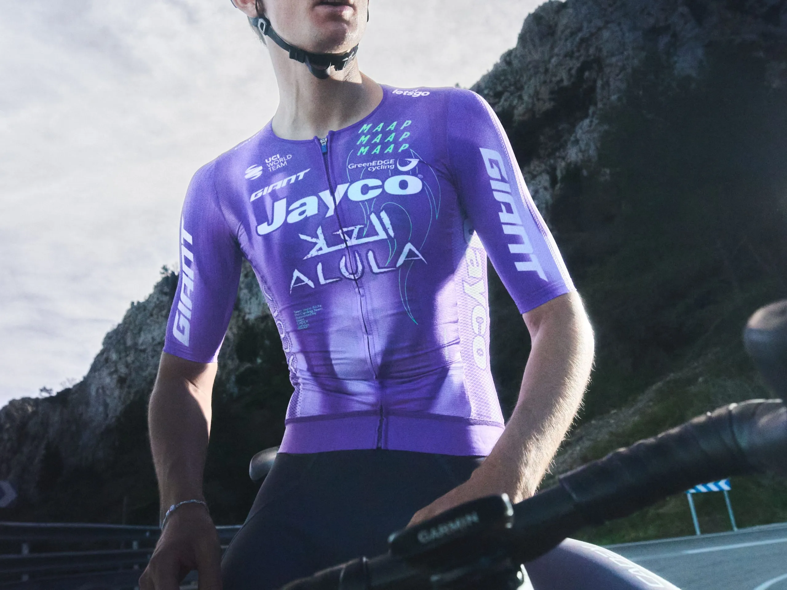
After topping our list in 2025, courtesy of Maap’s arresting WorldTour debut, Jayco fall some places as Maap deals with a minor sophomore slump.
Thankfully, the purple stays, though this looks more lavender in tone than the so-called ‘Arabian sunset’ of last year’s seminal jersey. Not just that, it also adopts a smoky effect instead of the flowing gradients of 2025, with outlines of smoke puffs etched in mint green. There’s less talk over the grey bibs this time around as well. They fit in well here, and the shade is far more appropriate than the Papal smoke colour of Ineos’s attempt.
Together, it feels this has less impact than its predecessor. Perhaps there’s less surprise with this one, or less razzmatazz around the reveal. However, I’m just not quite as enamoured by the GreenEdge kits for 2026.
Note: Hot Wheels vibes
Score: 7/10
5. Decathlon-CMA CGM
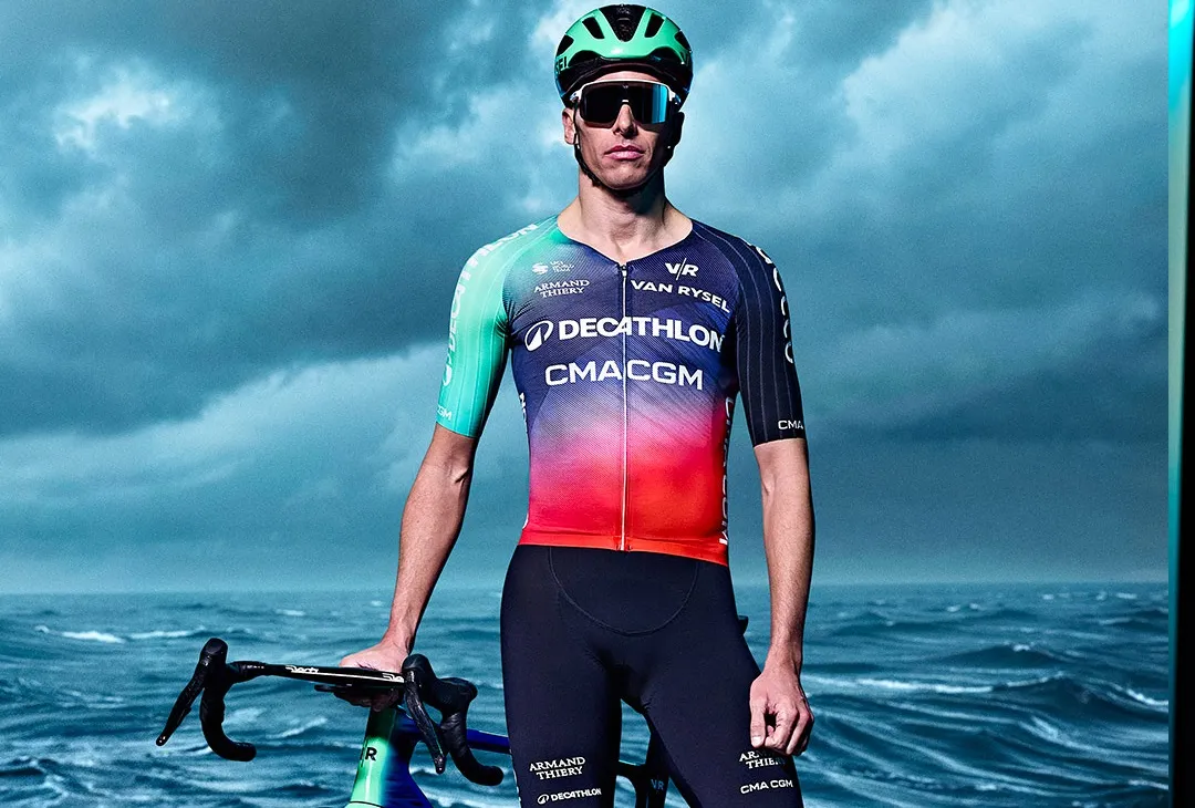
This might be my most divisive opinion so far, but I am a staunch advocate for the all-new Decathlon kit. Let me state my case before you place my head on a pike, please.
Where have we seen red, aquamarine, blue and black all mixed in together? Old school Bora-Hansgrohe. Perhaps I’m pining for prime Sam Bennett, but this jersey ticks all the boxes for me. Visually distinctive, asymmetrical and tasteful.
This jersey isn’t quite as showstopping as those Bora kits of old, but it’s certainly unique. The blue of Decathlon-AG2R was getting old, and these dashes of red have helped to reinvent their look. In a sea of blue within the peloton, this kit should be easy to spot from a helicopter shot – especially in sprint train formation on Olav Kooij duties.
Note: Blue and Red on a French team’s jersey? No way
Score: 8/10
4. EF Education-EasyPost and EF Education-Oatly
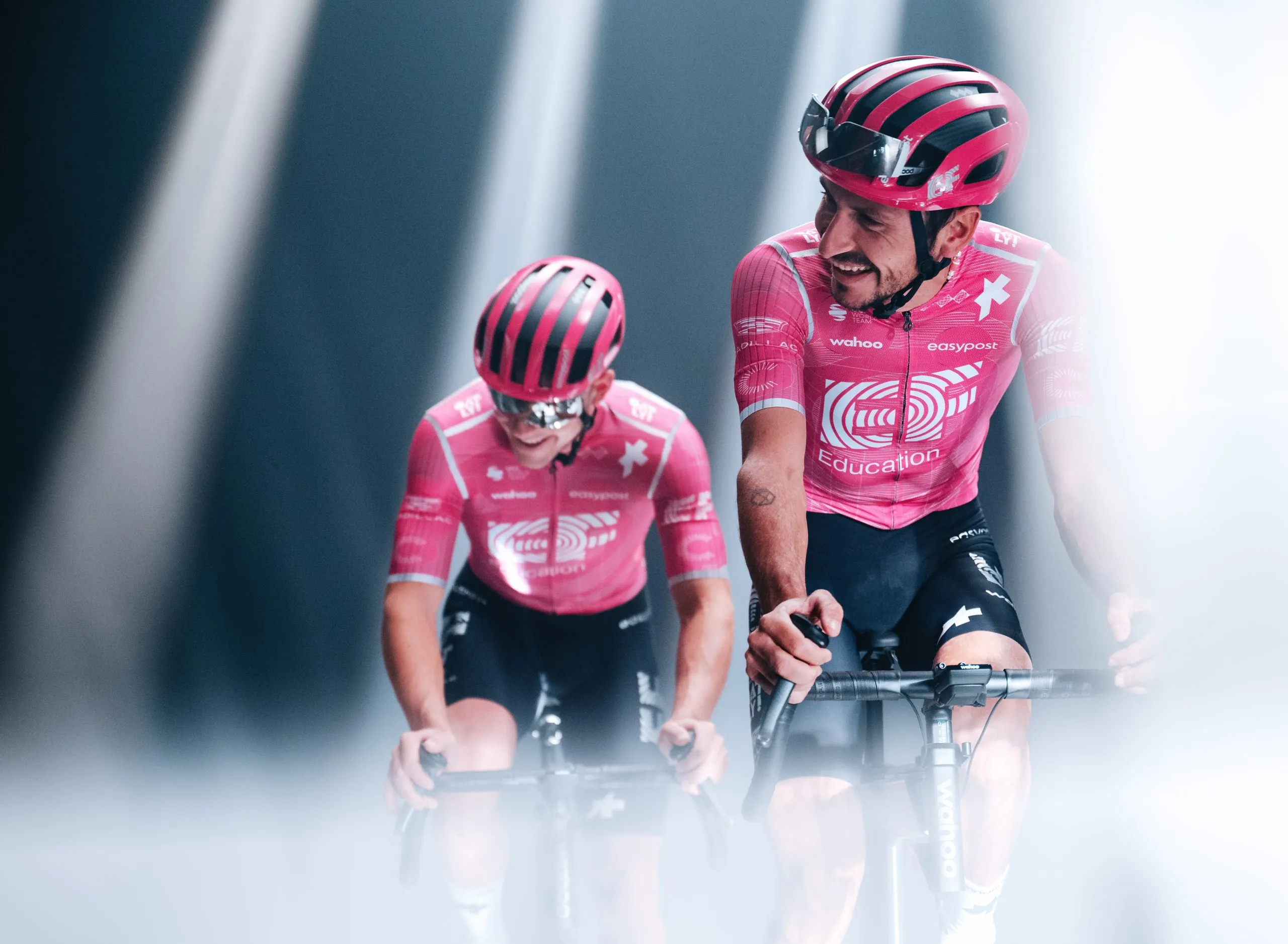
It’s all change in the EF changing room for 2026. Gone is Rapha, who’ve headed stateside to sponsor the US national team, and in is Swiss brand Assos, who haven’t supplied a WorldTour team since the Qhubeka days in 2021.
Despite this change of hands, the squad holds onto its iconic hue. The notable changes here, however, are some rearranged sponsor logos and the addition of white lines around the sleeves and side panels, which do some heavy lifting in setting this jersey apart.
Indeed, this is a lot tamer than the team’s previous efforts, with few distinctive bells and whistles. There are no ace of spades references or tiny cartoon crocodiles, just a circular motif that barely shows up on camera. On a close-up though, you’ll spot that it neatly encompasses each sponsor logo.
I think that summarises this jersey: well executed but a little more boring than normal. Though while it’s easily EF’s worst kit since 2021, it’s still distinctive. I mean, it’s hot pink, how can it not be?
Note: Clean but boring
Score: 8/10
3. SD Worx-Protime
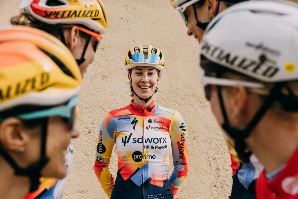
After years of rehashing kits wrapped in pinks and purples, SD Worx-Protime have corrected the woes of Lidl-Trek’s court jester jersey in an unavoidably loud outfit.
No primary colour is spared in this visually arresting number. There are Post-it note-like strips of blue, red and yellow across the top half of this jersey, which is offset by a stylised asterisk – a reference to SD Worx’s logo. This confetti cannon of colour is softened by some navy bibs, which stretch onto the main body of the jersey.
To top it off, this kaleidoscope of a kit is paired with a yellow helmet. All together, this caps off a visual sugar rush. In fact, this could be considered the birthday cake of the women’s peloton.
Note: Post-it notes meet court jester
Score: 8/10
2. NSN Cycling Team
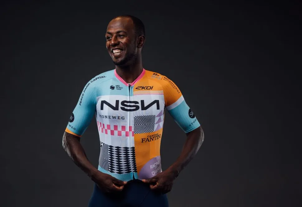
On paper, orange, turquoise, pink and purple sound like a horrific car crash of a colour palette. Neither should a checkerboard pattern, stripes, nor Aztec-style patterns mix. Yet, here we are.
Yes, NSN Cycling Team – formerly Israel-Premier Tech – have released a real stunner of a kit. It’s bright, eye-catching, but not too sore on the eyes (if anything in Lycra can be). Every sponsor logo has its place, it’s got some playful features and something to work with when it comes to the squad’s brand identity.
According to a press release provided for this kit, the design was ‘inspired by the geometry, colour blocks, and patterns reminiscent of contemporary Barcelona’, the city the team now calls home. I’m not sure I quite see it the same way – I would have added some tourist hostility and pickpocketing to that moodboard.
That aside, this jersey is bound to split opinions. Part of me thinks it’s trying too hard, almost like the walls of a local youth group. Chances are, this’ll date like a bag of piss, but I’m on board for now, even if it is laid out like an anti-drugs leaflet for teenagers.
Note: Distinct lack of Andrés Iniesta references
Score: 9/10
1. Canyon-SRAM-Zondacrypto
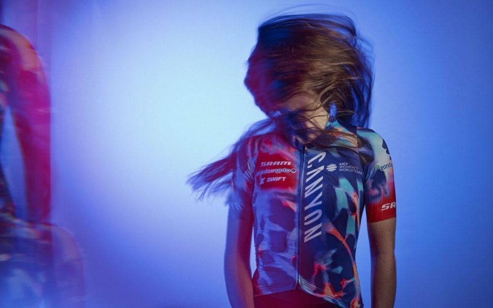
Top of the pile in 2026 is Canyon-SRAM-Zondacrypto. Who else could it be, really?
Like many of the jerseys we’ve already discussed, this jersey benefits from the great cull of pink in 2026. Instead, we’ve swapped out those Barbie tones for a nuclear indigo. Paired up with the splodges of red, this jersey stands out, and sets a real style precedent in the bunch. It’s unlike anything else and it sure as hell stands out.
Above all though, this jersey feels like more of a design piece than a brand billboard. The sponsor logos are kept minimal and hidden away, especially the crypto-bro banner on the sleeve.
Endulge me for a moment, but I reckon this looks like something Effy Stonem would have worn to an underground rave in Season 3 of Skins. It’s very 2006, but that Y2K aesthetic is all the rage right now.
Note: Nightvision goggles
Score: 9/10