

The T20 World Cup has introduced an unfamiliar and interesting looking graphic. It shows up when a new batter comes to the crease, or when a new bowler starts his first spell of a game. If you have followed along at all, you know I am talking about the new Skill Scale metrics on the broadcast.
At first glance, it seemed promising. I expected explanations about the system and potentially insights into how the primary media rights holder of our sport was shifting towards a more data-driven view.
Sadly (although some of you might argue this was always going to be the case), it did not take long for all that hope to turn into frustration and annoyance at the broadcasters.
For a topic with so much discourse online (albeit mostly criticism), it was quite disappointing that I was not able to find any official material on its methodology. So, I am going to try and reverse engineer their logic.
Using real statistics, and an intuitive guess at what traits the broadcasters were trying to display, maybe we can figure out what this “Skill Scale” actually indicates for batters.
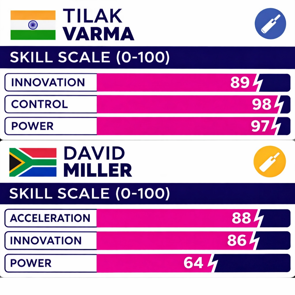
During the India vs South Africa match in the Super 8s, the comparison between Tilak Varma and David Miller was amusing. Even without any advanced data or statistics, anyone who has ever seen Miller bat would argue that his power should not be less than Varma – and definitely not by an absurd margin of 33 whole points!
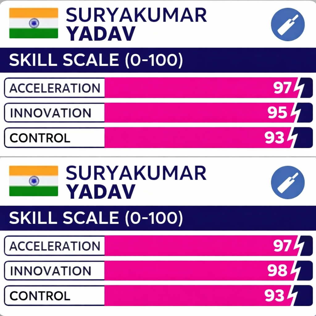
But, these two “graphs” also point out another odd inconsistency in the Skill Scale. The metrics keep changing for the players, with only three of the four shown at a given time. Additionally, these metrics keep changing without explanation!
Suryakumar Yadav was great against USA scoring 84 (49) – but did that game significantly change our understanding of his “Innovation”? If it did, is his random 3-point boost too small?
However, at least that makes some logical sense. Going back to Miller, someone at either Cricviz (who runs the backend production, according to a tweet by former India analyst Himanish Ganjoo) or the broadcast really messed up. Between his games against New Zealand and India, his Acceleration and Power stats were flipped for each other.
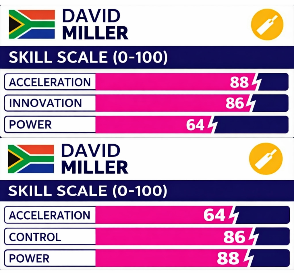
Regardless of which game’s numbers are correct according to their backend stats, it does seem odd to argue that Miller – one of the premier T20 batters in the world – is a 64 in either Acceleration or Power!
As a baseline to start this analysis, I collected the metrics for 46 batters from eight teams expected to be in the Super 8s (sorry Zimbabwe – I underestimated your giant-killing abilities!).
Additionally, it should be noted, I only collected one set of metrics for each batter – so, we got the David Miller who played against NZ with an Acceleration of 64 and a Power of 88.
Control (45 instances) and Acceleration (41) were the most commonly prevalent metrics for the batters I looked at, followed by Power (29) and Innovation (23). The mean number for all 46 batters across all 4 metrics was in the 80s, ranging from 80.6 for Innovation to 86.6 for Power. All largely good batters, presumably without a huge difference between their stats.
To reverse-engineer the process, I used data from T20Is, but also the major limited overs franchise leagues in India, Australia, UAE, Pakistan, South Africa, England & the Caribbean. Only games from post 2020 were considered, leading to a data set of 1,195 games and 107,387 deliveries faced by our 46 chosen batters.
Before we can do any analysis though, we have to address the elephant in the room. The Skill Scale metrics are not common metrics with objective definitions. While the phrases themselves may be commonly used while discussing T20 batting, they’re not undisputed numbers like runs scored, balls faced, or wickets lost.
So, I’ve had to start this exercise by guessing what each word is trying to signify, based on common sense and an understanding of the game.
As such, we had to guess a series of metrics that could potentially be related to each Skill Scale metric. Variations of strike rate for Acceleration, variations of dismissal rate for Control, variations of shot unorthodoxy for Innovation, & variations of boundary-hitting for Power.
Without going deep into the maths of it all, I used a formula called the Pearson’s Correlation Coefficient to connect our known metrics to the Skill Scale’s unknown metrics.
In layman’s terms, the idea was to compare the numbers of our normal data to the Skill Scale data, and see how closely the latter changed when the former was changed.
The calculation spits out a fairly easy to understand number – a range from -1 to +1. The magnitude (absolute value) of the coefficient simply measures the amount of correlation between the known cricket metrics and the unknown Skill Scale metrics.
A +1 score indicates that a particular metric is perfectly proportional to the Skill Scale metric. For example, if the Acceleration to SR comparison was +1, a batter with a higher SR would have a proportionately higher Acceleration number.
A -1 score indicates that a particular is perfectly inverse to the Skill Scale metric. For example, if the Acceleration to SR comparison was -1, a batter with a higher SR would end up having a lower Acceleration number.
Simply put, if the Correlation Coefficient recorded is close to +1 or -1, that standardised metric is very closely correlated to the Skill Scale metric (either proportionally, or inversely). If it is close to 0, that means there really isn’t any connection between the two metrics.
Don’t worry, I’ve got graphs that make it all easy to understand!
Around the water cooler, we tend to accept acceleration as probably the most important trait for a T20 batter, even if we don’t have a fixed definition. If you can score runs fast, you’re good. As such, we tend to look at the imperfect strike rate as a baseline measure.
But, what if we compared the Skill Scale’s Acceleration metric to different kinds of strike rate metrics, as well as a few others that could be studied to define the term?
As such, the metrics I thought would be most interesting for Acceleration were the following.
-
First 10 Ball Strike Rate (balls 1-10)
-
Next 10 Ball Strike Rate (balls 11-20, called Phase 2 SR in the plots you will see)
-
Established Strike Rate (strike rate from 11th ball onwards)
-
Acceleration Delta (difference between Phase 2 SR and First 10 Ball SR)
-
Non-Dot Ball Strike Rate (how fast does the batter score when on his non-dot balls)
-
Dot Ball %
-
Boundary Frequency (number of balls hit for 4 or 6)
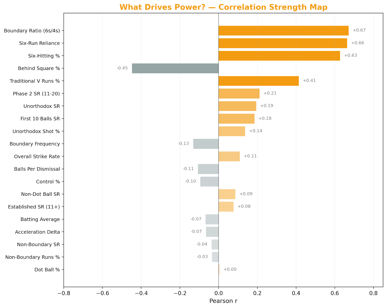
These are just the most relevant metrics for Acceleration according to my assumption. To safeguard against me potentially reading the production team’s mind wrong, I’ve compared every standard metric I could think of against all 4 Skill Scale numbers.
-
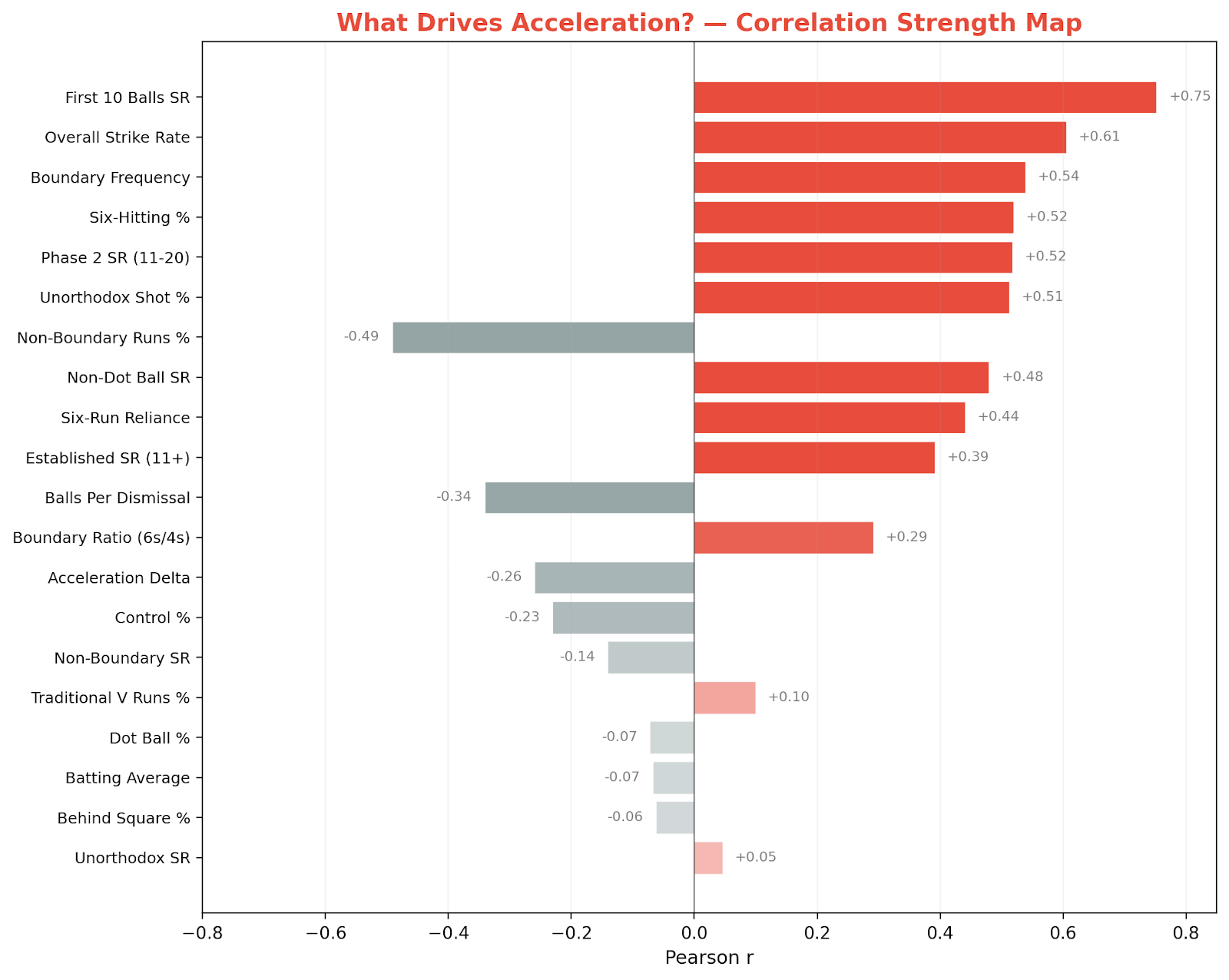
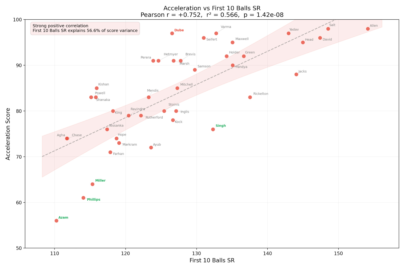
As expected, the “First 10 Balls Strike Rate” has the most relation with Acceleration. “Overall Strike Rate” is also not far behind, along with the “11-20 ball Strike Rate”.
-
Factors such as a high “Boundary Frequency”, “Six Hitting %”, and “Unorthodox Shot %” also find themselves high up on this list. This is understandable since all those, in some way or the other, indicate more runs being scored.
-
Interestingly, “Non-Boundary Run %” has a moderate negative correlation, indicating that this metric tends to penalise players who run more than hitting boundaries. A similar trend is also seen for “Balls per Dismissal”.
-
Stats such as “Batting Average” and “Dot Ball %” have almost no impact on this as well.
Now that we have a baseline of the most closely related metric, let’s plot “First 100 Balls SR” against all our batters’ “Acceleration” rates to see which ones are underrated (green text) and which are overrated (red text).
-
Even though Ryan Rickelton and Will Jacks have a much higher first 10 ball strike rate, Shivam Dube has a much higher “Acceleration” score.
-
Aiden Markram (Acceleration of 73) strikes slightly better than Ishan Kishan (85) in the first 10 balls, despite his much lower Skill Scale rating.
In cricket, we already have an advanced (and secret) metric called control percentage. In short, it measures how “in control” a particular batter is of any given shot. Some data collectors measure it in binary terms (in control, or out of control, for every shot), some measure it in more nuanced terms (slightly in control, very in control, etc.), but either way it has become a normal part of cricket discourse.
Thus, it makes sense to use that plus the following metrics to guess at what the broadcasters were thinking about for Control.
-
Control Percentage
-
Balls per Dismissal (how early does a batter get out)
-
Non-Boundary Runs % (% of runs scored by running between the wickets)
-
Non-Boundary Strike Rate (self explanatory, although this also considers dots)
-
Traditional ‘V’ Runs % (% of runs scored in the ‘V’, ahead of the batter)
-
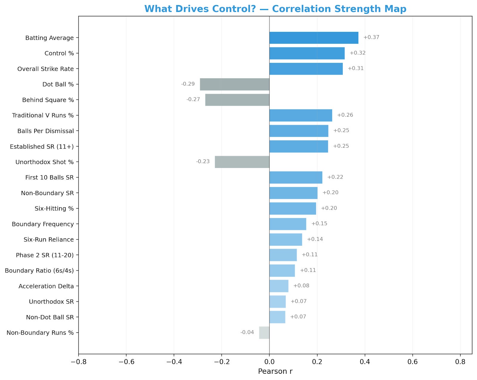
Unlike “Acceleration”, none of the statistics have any considerable correlation with “Control”. Funnily enough, even “Control Percentage” is the second most correlated statistic after “Batting Average” – a statistic that most of us agree is irrelevant in T20 cricket.
-
“Batting Average” and “Overall Strike Rate” are both in the top 3 most correlated features.
-
“Dot Ball %” finds itself to be the most negatively correlated along with “Behind Square %” (even though both the coefficients are not that significant). It does still indicate that players with a higher number of dot balls and playing more shots behind square are considered to be less in “control” of their innings
-
Most other statistics do not have a big enough coefficient to be worth discussing here.
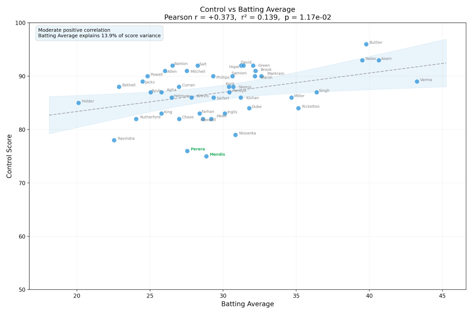
While we don’t have any closely related metrics, let’s plot the closest – “Batting Average” – against all our batters’ “Control” rates to see which ones are underrated (green text) and which are overrated (red text).
-
Despite the correlation of this one metric, there are quite a few batters – especially from Sri Lanka – who are underrated in the Control metric.
-
Comparatively, the English batters seem to have higher Control rates than their batting averages justify.
-
Of course, this could also all just be coincidence because the Skill Scale’s Control rate doesn’t seem to be closely related to any real world metric at all.
Of all 4 Skill Scale metrics, Innovation might be the most subjective and controversial. Different people would calculate it differently (and you could argue an innovative shot for one batter isn’t necessarily innovative for another). Moreover, there’s no objective truth that a “traditional” batter is less effective than an “innovation” one.
However, putting that all aside, there are a few potential metrics worth checking.
-
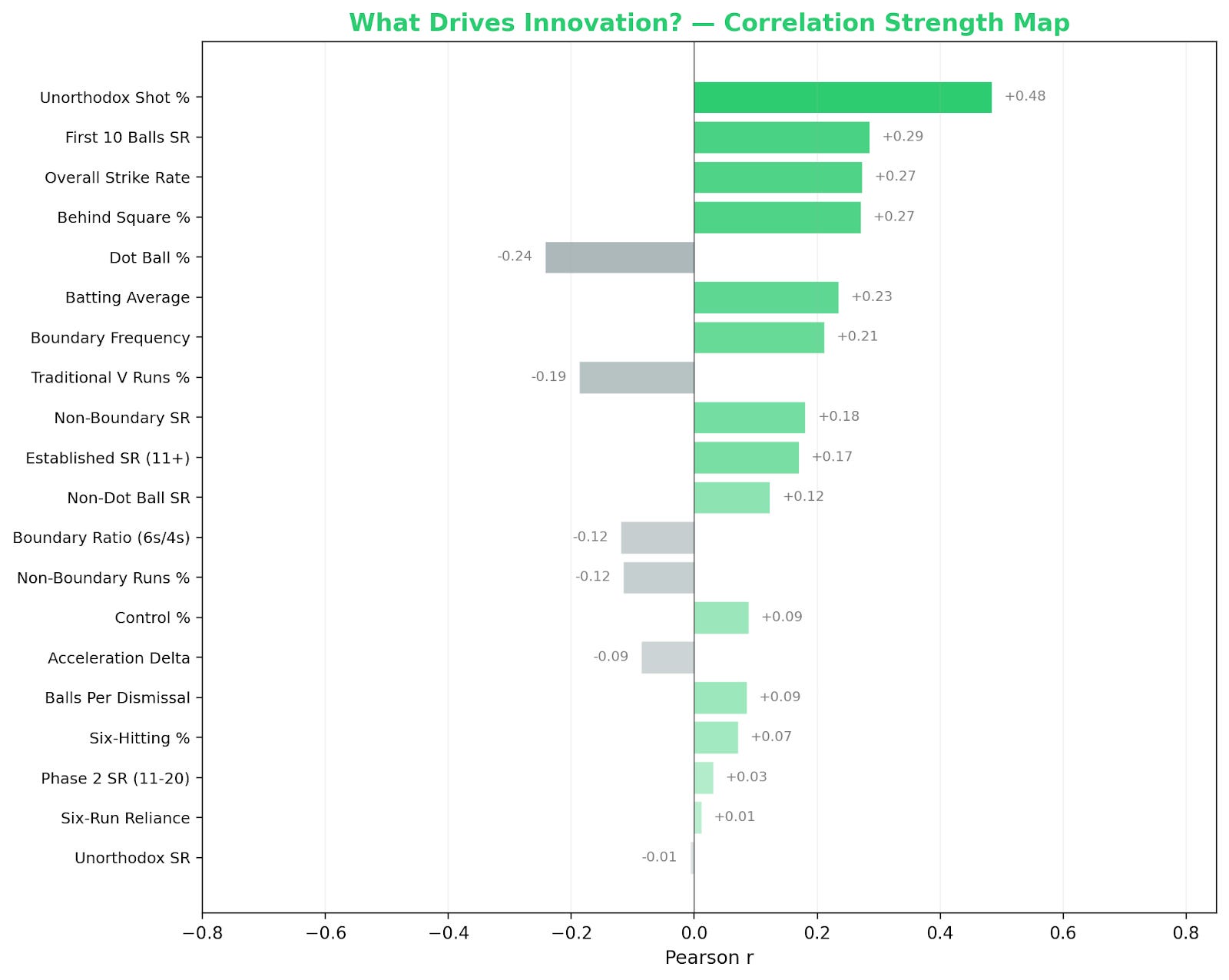
Like Control, none of the coefficients are high enough to explain the creation of the Innovation metric.
-
“Unorthodox Shot %” seems to be the most obvious candidate for comparison, alongside both “First 10 Ball SR” and “Overall SR”
-
Similar to Control, “Dot Ball %” tends to have a negative correlation.
While we don’t have any closely related metrics, let’s plot the closest – “Unorthodox Shot %” – against all our batters’ “Innovation” rates to see which ones are underrated (green text) and which are overrated (red text).
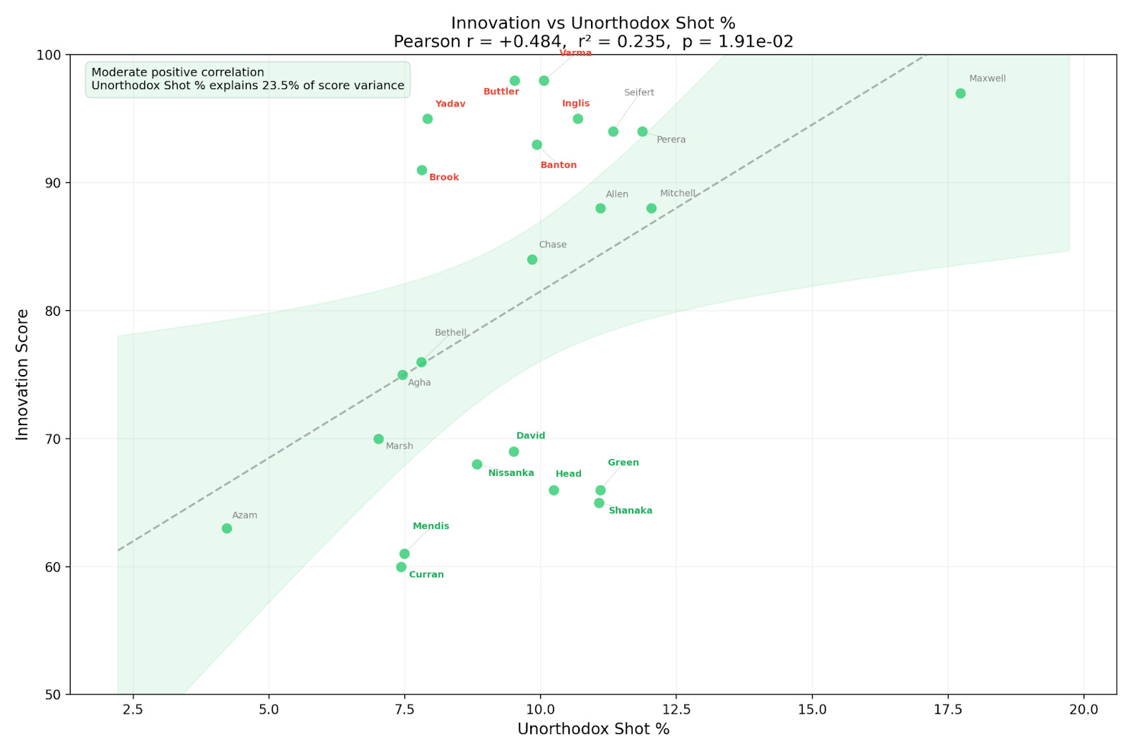
-
Cameron Green hits 2.5% more unorthodox shots than Suryakumar Yadav, but his Innovation score is just 66 – a massive 29 points less than SKY’s 95.
-
Even at identical percentages of unorthodox shots played, Tim David’s Innovation is only 66 while Jos Buttler is at 98.
Power screams six-hitting, though it may again be pertinent to ask if that’s even a relevant measure. It reduces a fairly complex sport with bowling strategies, fielding plans and player matchups on any given ball to just strength. Then again, maybe that is the future of T20 cricket!
As before, I’ve looked at established metrics that would make the most logical sense for Power.
-
Six Hitting % (percentage of 6s hit across total balls)
-
Six Run Reliance (percentage of runs scored exclusively from 6s)
-
6-4 ratio (ratio of count of 6s to count of 4s)
-
Here, we do see some promising results. All 3 of my chosen statistics for “Power” find themselves at the top with significant correlations. This metric is seen to reward players who obviously hit a lot of 6s but more importantly, it also rewards those who are hitting more 6s than 4s!
-
Another interesting takeaway is that while “Percentage of Runs in Traditional V” has a positive correlation, the “Percentage of Runs Behind Square” has an almost identical negative correlation. I wonder if that’s because those are opposite metrics to the broadcast team, or just because it’s rarer to hit a 6 behind square than it is to hit one down the ground.
-
The weak positive correlations with Strike Rate variations and the lack of “Batting Average” correlation makes sense, and those metrics can probably be ignored.
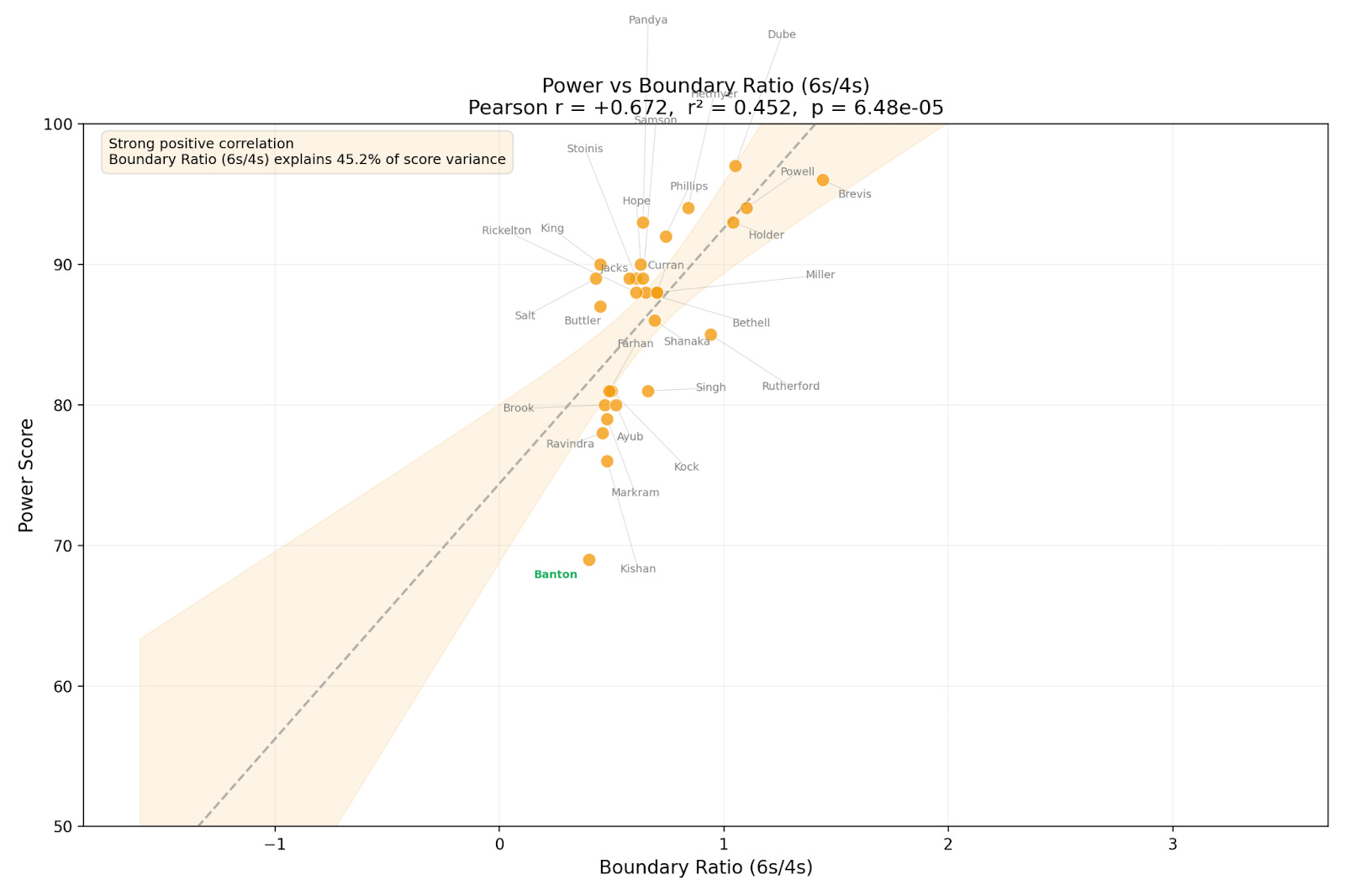
Now that we have a baseline of the most closely related metric, let’s plot “Boundary Ratio” against all our batters’ “Power” rates to see which ones are underrated (green text) and which are overrated (red text).
-
This is the most tightly clustered plot of all 4 metrics and you can clearly see the vast differences in “Power” scores for players with the same boundary ratio.
-
Tom Banton (who hasn’t really had a big innings yet) seems to be severely underrated, and the one major outlier in this dataset.
As you may have noticed, batting average and overall strike rates are relatively highly co-related to three of the four Skill Scale metrics. Which begs the obvious question; why are they trying to trash easy-to-check, well understood metrics that seem to indicate the same results as their fancy new metrics?!
That’s part of the problem here. The broadcasters aren’t just creating fancy new numbers that we can ignore. They’re using them instead of the regular career stats that are normally shown when a batter comes out in any format and/or tournament!
This black box of information also creates another problem; Associate nation players just have bad numbers regardless of their performances. It’s partly why I couldn’t use their stats – every player has drastically worse numbers across the board (including some zeroes!).
It reinforces the bigot’s ideology that cricket should just be played by the big teams, and that everyone from any other country is terrible just because they weren’t born in a Test playing nation.
Advanced stats are great, but they don’t offer the same easy-to-understand information for the average fan. Even if the system was perfect and came with a 50-page explanation of every calculation, it would not justify what we’ve lost.
I can only hope someone with power and/or shame at the broadcaster or the ICC can reverse this decision after reading everyone’s critiques of – and unhappiness with – it.